For the better part of last week, my Twitter has been hinting towards some big new redesign that is coming. On Monday, Twitter began rolling out its first desktop redesign in seven years. It was a mostly aesthetic makeover, with changes like a new layout, dark mode, and a more prominent search bar. As with anything Twitter, the reaction has been polarizing, with many users criticizing the platform for not doing enough to address its major problems.
The new design finally dropped on my account and it is…..different. It looks a lot like the mobile version of the website than anything else really.
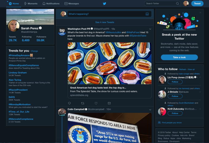
Old Dark Mode Twitter 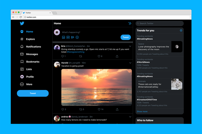
New Dark Mode Twitter 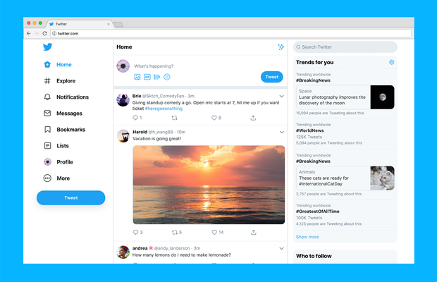
New Twitter
The update is designed to make it easier to move around Twitter. Before, you’d have to click on your Profile icon to access features like Lists, Themes, Settings and other options. Meanwhile, getting to Moments was available both in this Profile drop-down menu and in the main Twitter navigation at the top of the screen, next to Notifications and Messages.
With the update, the new navigation menu includes: Home, Explore, Notifications, Messages, Bookmarks, Lists, Profile and More — the latter, a menu where you’ll find things like Moments, Twitter’s ad tools, Settings and other features.
The new Compose feature has been slightly tweaked as well, with options to include a photo, GIF, poll or emoji now all in the bottom left — with the emoji button now swapping in for the location button, following Twitter’s decision to make sharing precise location less of a priority, given its lack of use.
Though the new home screen is arguably better-organized, the navigation text itself and the amount of screen real estate it takes up is overly large.
There’s some bad news for old-school Twitter.com users — as of this public launch of the redesign, there’s no option for going back to the legacy experience, as there was during the testing period.
Inpost images courtesy of TechCrunch


