Genius is when a product maintains its relevance on the market even after decades of little or no iteration. I still marvel at Tupac Shakur’s 1997 hit track, Changes. It clearly talks about how change will take it’s course on us whether we want it or not. The funny bit, however, is that the song still sounds relevant, 16 years later, no matter the ever changing notorious dynamics of the music industry.
Whilst many people attach sentimental values to products they interact with on a daily, the real connection is brokered by the products’ branding . Of course, an interplay of various forces of demand and supply that vary from one person to another affect product distribution and hence usage. Arguably, that is the reason why companies like Coca cola,FedEx, BBC are still busking in glory or rather surviving despite the fact that they don’t change their logos save for the tweaks. On a subjective note, struggling companies subconsciously think that a total overhaul of their logos is what pulls off the whole concept of re branding. They forget that re branding is more than just logo redesign.
This generation, the information age, has faced a paradigm shift is science and technology sired by fast paced innovations in creating improved user experiences. The pressures faced by modern day marketers to appeal to as many as possible have worsened the situation. In an interview with NPR, the late Steve Jobs said that one of the goals of Apple “was to bring a liberal arts perspective and a liberal arts audience to what had traditionally been a very geeky technology and a very geeky audience.” Not only did Steve’s blending of arts to market science products turn out very successful but also passed to be an industry standard.
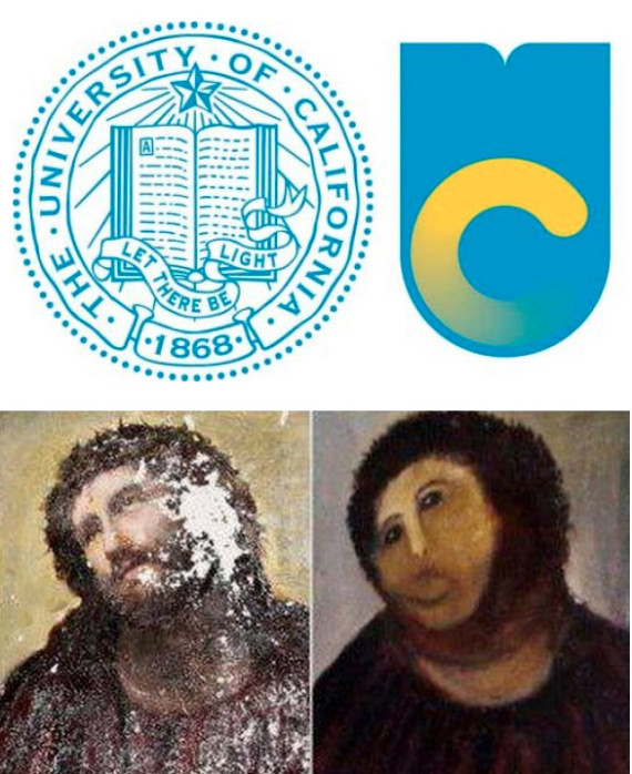
Sure, the modern day design trends have been playing a contributory factor to the various branding campaigns. In pursuit of appearing relevant and appealing to many, incorporations are spending ridiculous amounts of dollars in keeping up with the joneses. For instance,In December 2012, UC Berkeley and Stanford University among other organizations succumbed to this fad by changing their logos albeit citing ‘legitimate’ reasons. This didn’t go well with students, alumni and well wishers who have since denounced approval of the new logos. Reports have it the UC Berkeley dropped the new logo immediately.
One wonders why there is/was so much resentment?
The answer is, the pull factor was obliterated, and, there are usually two options to choose from– finding a substitute or soldiering on. In most cases, there is a heavy intimate connection to a school’s logo, national emblem, favourite beverage illustration et al and one wouldn’t watch away in resolve. At least, they would heavily rant on social media or probably sign online petitions or even protest on the streets.
Classical Greek philosopher, Aristotle, defined the three elements of great communication as ethos(credibility), pathos(emotional connection), logos(how people reason to make decisions). Today, logos–rhetoric word originally meaning “a ground”– doesn’t really due to the tantamount levels of irrationality among people. At the end of the day, pathos has the greatest influence on followers’ perception of their leader’s effectiveness as a communicator.
Henceforth, the kind of logos that will never change(or subtly be tweaked) are; those built with principles of good logo design at hand, those that trigger an emotional attachment with the people and those designed to stand the test of time.
Image via HuffPost
Discover more from Dignited
Subscribe to get the latest posts sent to your email.


